Some Lovely Ladies are hosting a Pinterest Challenge again. Bower Power, Young House Love, Centsational Girl, Ten June Blog, are all such inspirational blogs and are holding linky party's for everyone to join in the fun of the Pinterest Challenge.
So I thought I would share this little project I did from some Pinterest inspiration.
This is my inspiration. I saw it on Pinterest, but the picture links back to Desire to Inspire.
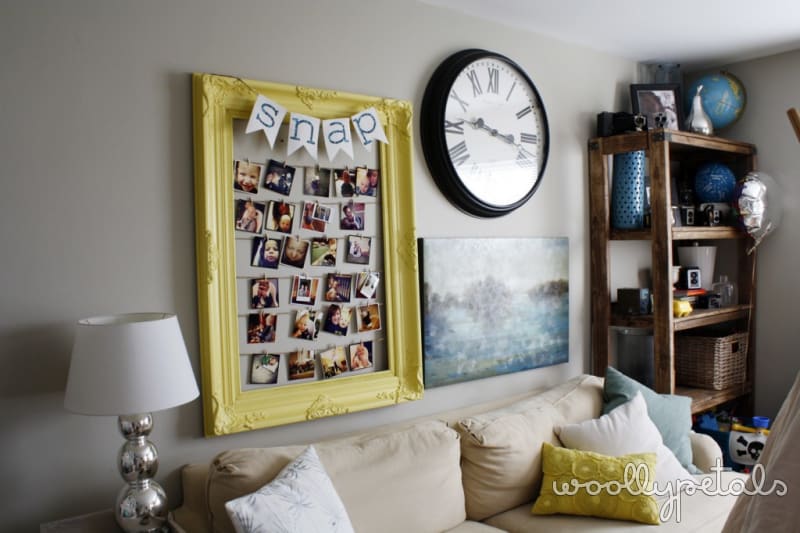
I love the boldness of the 8 art. I like that it's not perfect, the it's a number, and thats it just simple black and white. I also felt like I needed something different above my sofa. I like the instagram frame a ton, but I moved it to the basement to go with my yellow chairs. I just wasn't feeling it above the sofa, so we had blank space. Refresher.
So I found this framed canvas, sorry I forgot to snap a before picture. Just imagine an abstract canvas in soft greys, purples, light blue, pinks, really ugly. :) But framed with a simple nice frame, little to no texture, and the right size for roughly $4. Sold. I saw it and knew it would be perfect for this project and loads cheaper than buying a new one in a larger size.
So here you have it! I went with a 3. I guess mainly I did a 3 because we are a family of 3. :) Cheesy..no?
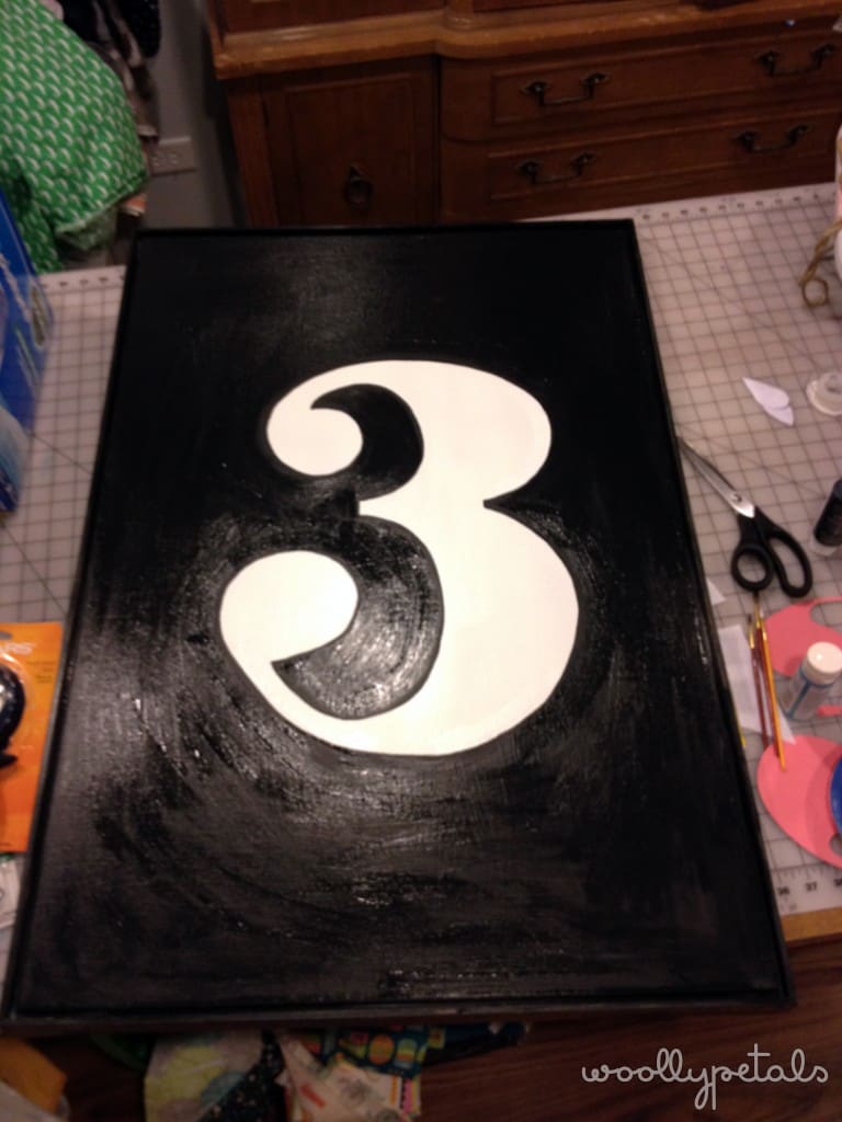
The simple process, I spray primed the canvas part, a little over spray got on the outer edges of the frame which you can see in a picture further down. I haven't decided if I want the sides of the frame to be black, white, or a color, so for now they are unfinished.
(iphone pictures above)
I then printed the largest 3 on 8.5″ x 11″ paper and used it as a rough guide to free hand a larger three as shown on the left. Basically I sketched it with pencil on the white background and then filled in the black around it. Simple, and I didn't have to worry about white covering black if I had done it the opposite. To give you an idea of scale, the canvas is roughly 2′ x 3.5′.
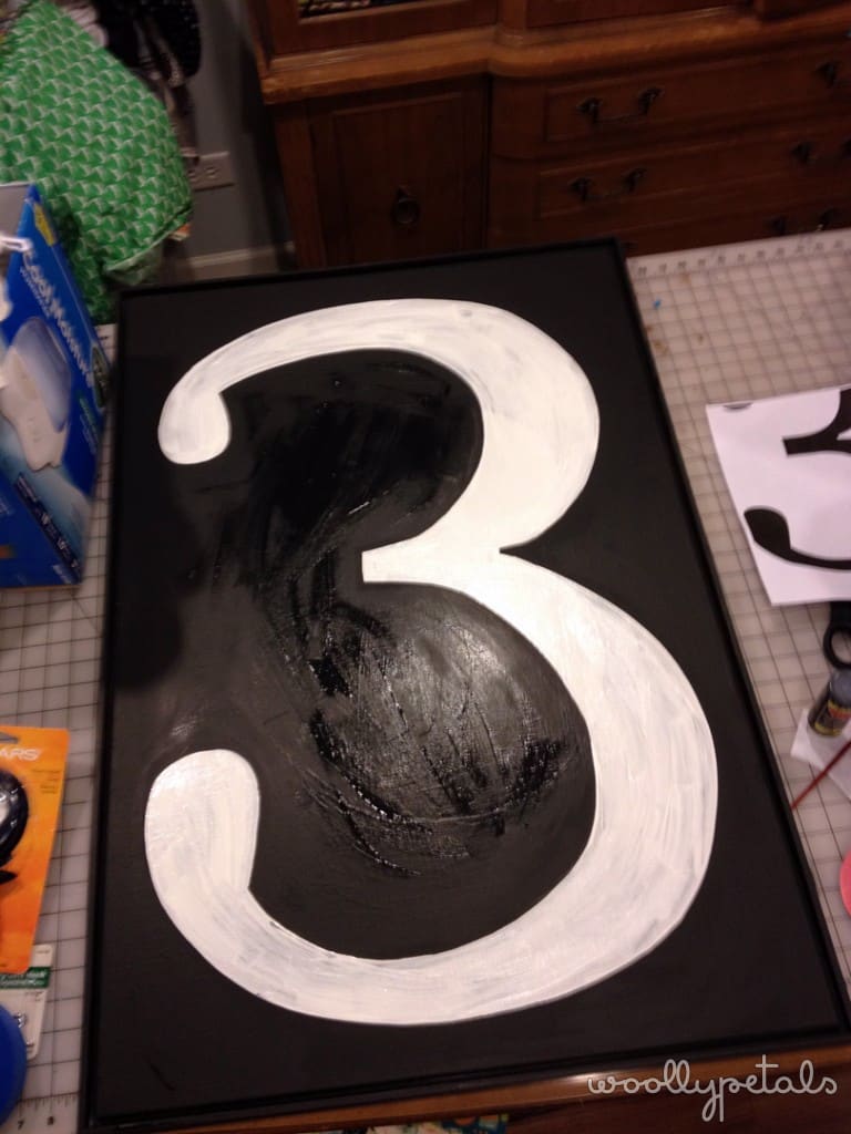
We hung it up and just didn't love it. We (hubby and I) thought it was fine, but we like to Love the things in our home. So I revisited the inspiration picture and realized the 3 wasn't big enough. I also thought a little simpler lines would be nicer. So I sketched, with pencil, the larger three and painted it. I had to go back over some of the old three with black too, It turned out better to me this way, because it gave it some depth and some of the imperfection I wanted.
See the unfinished edges? Any weigh in on the outer edge frame color would be great. :) The above and below picture give you a bit of a close up to see the more distressed look of the paint.
And the whole living room wall before (so you don't have to scroll all the way back up to compare).
And after. :) Much better. It just looks more us. I still have the Instagram Frame and incase you missed it you can check out this post of my basement craft room tour to see where it landed.
Thanks so much to the lovely Ladies behind the Pinterest Challenge for Challenging us and for hosting the great linky parties. Check them out for some awesome Pinspiration.
Thanks so much for stopping by!


